
Election fraud detection with data analysis
Why can we say just based on detailed election results if something was fiddled with

The concept of democracy has triumphed on normative level across the world. Large portion of even the most repressive regimes in the world carefully try to emulate even a semblance of democracy, even if it is with farcical and implausible vote margins where the autocrat receives 95% of the vote. It produces legitimacy to be proven popular – and they want their part of it.
It is truly an unfortunate reality for those who want to keep a democratic façade that as you go to a more detailed level with the election results for increased transparency and legitimacy, the voting data becomes increasingly harder to tamper with. This happens chiefly because exponentially more dimensions have to be taken into account for the data to remain credible: numbers of the data itself, historical voting patterns of the electoral area, geographical considerations and consistency especially related to neighbouring areas, timing considerations on election day and increasing vote share. And so on. Meaningful change in voting patterns requires a reasonable explanation as to what development caused it and why. It doesn’t just happen out of blue. When stuffing extra ballots to one box, you need to fix all the distortions it causes to a dizzying level across time and place.
Natural, non-tampered election result data obeys a slate of statistical rules. On most elementary level, the turnout level of mass of electoral areas (precincts, vote booths, municipalities, et cetera) follows a rather strict unimodal rule – it does not have several peaks long apart from each other. Rather, it resembles a bell curve, strictly with one clear peak.
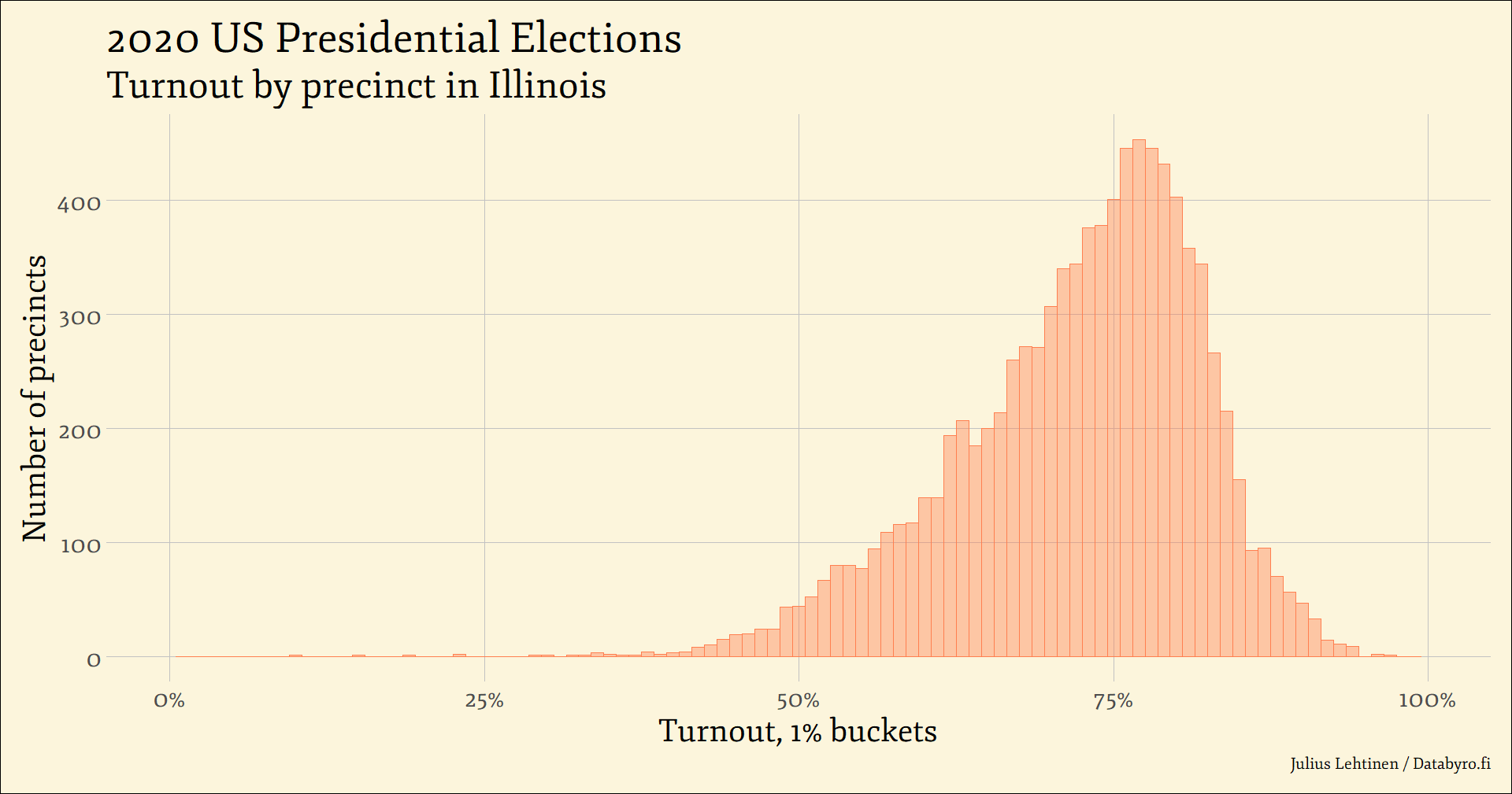
Take for instance the 2020 US Presidential Elections in the state of Illinois above. The turnout in the state was a nudge above 72%, and the mass of the individual precincts are clustered around that mark. With a decreasing volume as we get farther from the centre where the vast mass of precincts are. Which obviously makes intuitive sense: If turnout for the whole state is 72%, most of the data usually is clustering close to that. Think height or PISA scores.
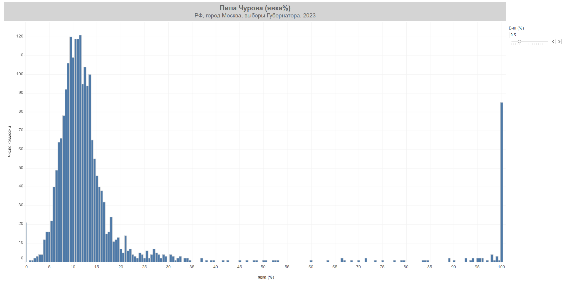
After all, it is really not a good look to have a bunch of voting areas with 98% turnout, especially when the turnout elsewhere is lower by orders of magnitude. Yet that is precisely what happened with Moscow gubernatorial elections of 2023. The candidate of the hegemonic United Russia party, Andrey Vorobyov, received over 80% of the vote and cruised to governorship of the capital region. The catch? Over 80 voting areas had a turnout of exactly 100%, and Vorobyov happened to receive over two million votes in the areas in question – two thirds of his total vote. More, the general turnout without those few hand-picked regions slugged around 10%. Not exactly subtle.
Especially physicist Sergey Shpilkin and the election monitor Golos have pioneered statistical tools to detect fraud, ballot-stuffing and other election-related wrongdoing from afar that goes much deeper than ordinary turnout histograms as above. And with a good reason. The statistical analysis of election results have a host of appealing features. The techniques are much less dependent on benevolence of the autocrat in allowing impartial electoral observers. You can imagine how much Alexander Lukashenko and Nicolás Maduro like to let outsiders snoop around investigating their delicate machinations on whether everything happens properly with elections.
Simultaneously the reach of prodding election data is infinitely more vast, comprehensive and takes less resources. With the amount of money and time it takes to organise a monitoring mission to Irkutsk or Maracaibo, one can employ a legion of statisticians prowling through the official data that the autocrat purports to be the real deal. And, deliciously, it most likely will turn the legitimacy-yearning façade against its very purpose, if tampering happened.
Additional dimension to turnout can be reached with contrasting vote share with it, with both absolute vote tallies and relative vote share of the total. Below are the two graphs done based on Italian Parliamentary Elections few years ago.
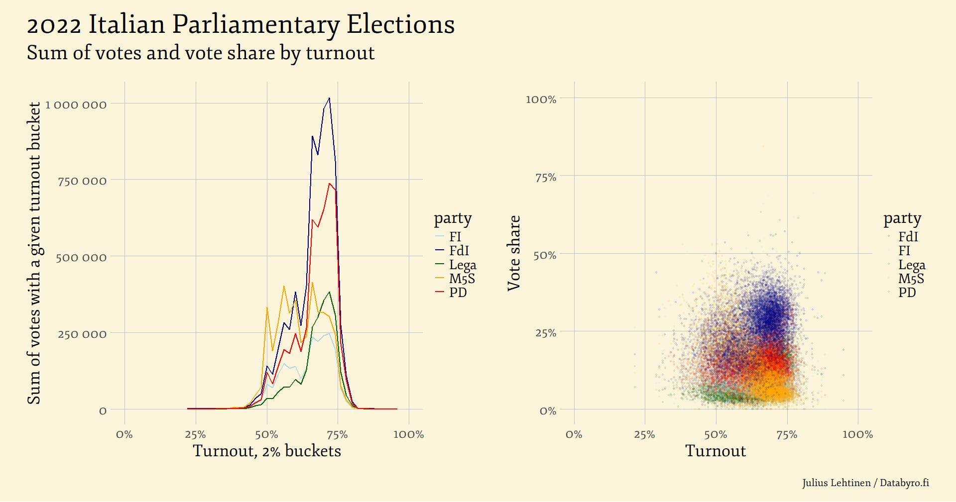
We can again notice the alluring feature of the left-hand panel showing a unimodal curve with all parties. The largest sum of total votes lays close to centre, as the vast majority of the voting districts are with a more or less average turnout. In turn, low and extremely high turnouts compared to average are uncommon, not numerous and hence produce low vote totals as there are so few of them. On the right we can notice that none of the parties received suspiciously high or low vote shares in high or low turnout municipalities.
These perfectly normal election results start to stand out when we contrast them again to a case of particularly egregious fudging. The election monitor Golos has helpfully collated some notorious ones from Russia, which regularly rigs the vote to prop up the governing regime of Vladimir Putin and his party.
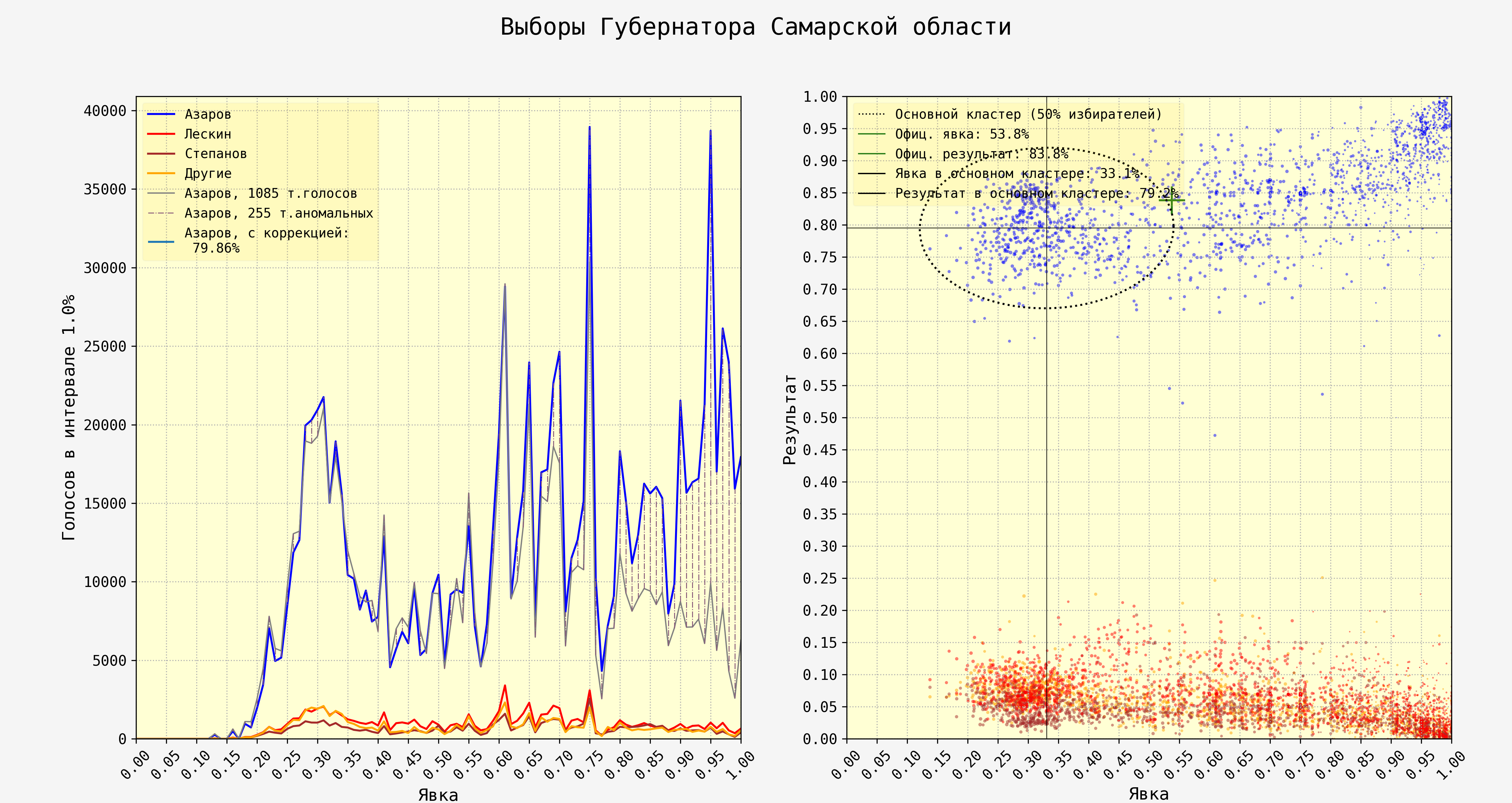
The above graph is from the regional elections of 2023 in Russia, from the region of Samara. The plots are in same configuration as in the Italian case further above; left one sums up total votes by each election station with a certain turnout, right one contrasts the turnout with the vote share of a candidate or party.
Yet the contents of the graphics diverge greatly between Italy and Samara. The natural unimodal bell curve in the Russian graph is around 30% turnout. Blue line and hence the vote total of Dmitry Azarov (United Russia, the dominant party) zigzags up and down all the way to 100% turnout, indicating he received hundreds of thousands of additional stuffed votes. In a completely unsurprising development, the biggest additional vote spikes come squarely at even turnouts of 70% and 95% per cent.
The graph on the right just confirms what we observed on the left: in the voting districts where the turnout was suspiciously high, Azarov received more and more votes. The “comet tail” is visible and distinctive, and not a trace of a similar effect is noticeable in the Italian data.
Humans tend to be bad at both detecting and producing random variation that is needed to maintain plausible deniability. And it is precisely in the human fallibility in tampering with elections convincingly taking all possible dimensions into account which showcases the strength in the statistical analysis of election results. Stuffing extra votes to ballot boxes in certain jurisdictions with favourable personnel rarely produces convincing and natural distribution of the said votes.
People in general are known to be gravitating unconsciously towards rounded numbers. They are simple and easier to process. Election results data does not regularly produce rounded numbers, they happen only by chance every rare now and then, as is again intuitive. For instance, in 2020 United States Presidential Elections the final vote share results of the two main candidates in 56 states (few divide their electoral votes) was in integer value, round number exactly once in 112 observations; Donald Trump in Virginia with 44.00% of the vote.
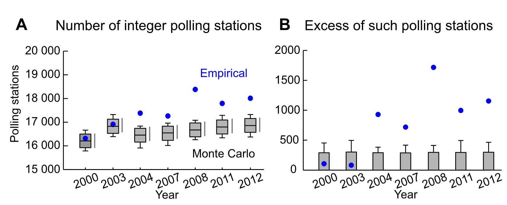
Could the statistical analysis of election results take advantage of this human fallibility? Certainly. 2016 paper named “Integer percentages as electoral falsification fingerprints” by Kobak, Shpilkin & Pshenichnikov did just that. They
analyzed raw data from seven federal elections held in the Russian Federation during the period from 2000 to 2012 and found that in all elections since 2004 the number of polling stations reporting turnout and/or leader’s result expressed by an integer percentage (as opposed to a fractional value) was much higher than expected by pure chance. Monte Carlo simulations confirmed high statistical significance of the observed phenomenon, thereby suggesting its man-made nature.
Kobak, Shpilkin & Pshenichnikov (2016, p. 54)
The authors later showcase the tens of thousands of polling stations that ended up with an integer vote share for a candidate, and then contrasted the empirical observations to Monte Carlo simulations as to how big the proportion of the integer vote shares reported should be. The totally unexpected result? There were thousands of more polling stations reporting with integer vote share than there should be with untampered data.
The tampered integer polling results are often witnessable also from our earlier style of graphics. Consider for instance the scatter plot of voting on constitutional amendements in Russia in 2020 (which enabled Vladimir Putin to bypass constitutional limits for consecutive presidential terms and run again), as explored in length by Cedar, a team of independent researchers, data scientists and journalists in exile.
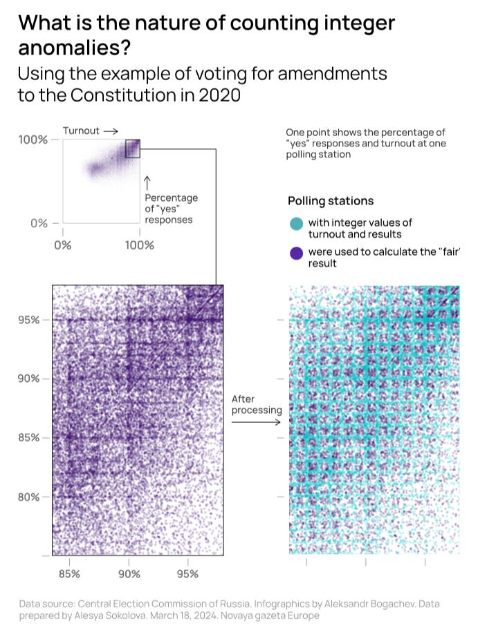
We can witness the familiar comet tail right with visually glancing, which already shows some red flags on election tampering. What’s more, with zooming in the absurd grid of voting districts reporting integer vote shares and/or turnout is clearly visible. The blatant vote rigging in Russia approaches to just showcasing the regime strength and sending a message: we will tamper with the results massively and obviously while there is nothing you can do to it.
Tampering with detailed election results is by no means the only technique in autocrats’ arsenal. Most of the time such is coupled with making up filmsy excuses to prevent too inconvenient people from running or outright throwing them in the jail for an eternity. Yet releasing more detailed election results remains a tool in manufacturing legitimacy because detailed election results is what legitimate states release. And data analysis of the results remains a strong antidote to that, as the detailed election results are exceedingly hard to tamper with without raising suspicions.
Awesome analysis. In grad school, my favorite statistics professor showed me this approach with Russian data to highlight the Putin regime's election fraud. Subscribed